Радио кнопки в стиле Metro
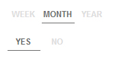
Metro стиль, стиль Windows 8, лично мне нравится, но есть и те, кто не считает его красивым. Если вам нравится, и Вы делаете элементы сайта в стиле Windows 8, то это дополнение будет кстати. По сути используются самые обычные радио кнопки, скриптов вообще нет, просто CSS код. Вместо списка с точками Вы будете видеть то, что показано на скриншоте. Цвета легко изменить, хотя и представленные вполне разумные, подходящие.
У нас есть еще дополнения в стиле Metro: например, иконки Windows Metro.
Код HTML
Code
<div class="container">
<div class="row pad-btm-40">
<!-- START tabs -->
<div class="span16">
<div class="spaceEmOut">
<fieldset class="switch switch-three">
<legend>Multi Switch</legend>
<input id="week4" name="view4" type="radio" checked />
<label for="week4">WEEK</label>
<input id="month4" name="view4" type="radio" />
<label for="month4">MONTH</label>
<input id="year4" name="view4" type="radio" />
<label for="year4">YEAR</label>
<span class="switch-button"></span>
</fieldset>
</div>
<div class="spaceEmOut">
<fieldset class="switch switch-two">
<legend>Single Switch</legend>
<input id="yes" name="view" type="radio" checked />
<label for="yes">YES</label>
<input id="no" name="view" type="radio" />
<label for="no">NO</label>
<span class="switch-button"></span>
</fieldset>
</div>
</div>
</div>
</div>
Код CSS
Code
<style type="text/css">
@media only screen
{
.toggle
{
color: #fff;
display: block;
font-family: sans-serif;
font-size: 12px;
font-weight: bold;
margin: 0;
padding: 0;
position: relative;
width: 200px;
}
.toggle label
{
display: block;
padding: 3px 0;
position: relative;
width: 100%;
z-index: 3;
}
.toggle input
{
opacity: 0;
position: absolute;
z-index: 5;
}
.toggle input:focus ~ .toggle-button
{
outline: 1px dotted #6B6B6B;
}
.switch
{
border: 0;
color: #fff;
font-family: sans-serif;
font-size: 12px;
font-weight: bold;
padding: 0;
position: relative;
width: 300px;
}
.switch legend
{
color: #6B6B6B;
display: block;
float: left;
font-size: 12px;
line-height: 15px;
padding: 7px 10% 3px 0;
text-align: right;
width: 40%;
}
.switch input
{
opacity: 0;
position: absolute;
}
.switch legend:after
{
border-radius: 3px;
content: '';
height: 100%;
left: 50%;
padding: 2px;
position: absolute;
top: 0;
width: 50%;
z-index: 0;
}
.switch label
{
color: #DEDEDE;
cursor: pointer;
float: left;
margin-top: 2px;
padding: 5px 0 3px 0;
position: relative;
text-align: center;
width: 25%;
z-index: 2;
}
.switch input:checked + label
{
color: #6B6B6B;
moz-transition: all 0.4s ease-in 0s;
o-transition: all 0.4s ease-in 0s;
transition: all 0.4s ease-in 0s;
webkit-transition: all 0.4s ease-in 0s;
}
.switch input:focus + label
{
background-color: #EDEDED;
moz-transition: all 0.4s ease-in 0s;
o-transition: all 0.4s ease-in 0s;
transition: all 0.4s ease-in 0s;
webkit-transition: all 0.4s ease-in 0s;
}
.switch .switch-button
{
border-bottom: solid 1px #6B6B6B;
clear: both;
height: 100%;
left: 50%;
margin: 2px;
moz-transition: all 0.3s ease-out;
o-transition: all 0.3s ease-out;
position: absolute;
top: 0;
transition: all 0.3s ease-out;
webkit-transition: all 0.3s ease-out;
z-index: 1;
}
.switch input:last-of-type:checked ~ .switch-button
{
left: 75%;
}
.switch.switch-two label
{
width: 16.6%;
}
.switch.switch-two .switch-button
{
width: 16%;
}
.switch.switch-two input:checked:nth-of-type(2) ~ .switch-button
{
left: 66.6%;
}
.switch.switch-two input:checked:last-of-type ~ .switch-button
{
left: 66.26%;
}
.switch.switch-three label
{
width: 16.6%;
}
.switch.switch-three .switch-button
{
width: 16%;
}
.switch.switch-three input:checked:nth-of-type(2) ~ .switch-button
{
left: 66.6%;
}
.switch.switch-three input:checked:last-of-type ~ .switch-button
{
left: 83.26%;
}
.switch.fcRed .switch-button
{
border-bottom: solid 1px red;
}
.switch.fcRed input:checked + label
{
color: red;
}
}
.spaceEmOut
{
margin-bottom: 15px;
}
</style>
Создать сайт в uKit
Нужен классный сайт для бизнеса?
Воспользуйтесь сервисом uKit. Никакого кода!
Воспользуйтесь сервисом uKit. Никакого кода!
Чтобы оставить комментарий или отзыв под этой публикацией, войдите или зарегистрируйтесь.