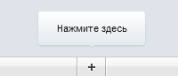
Прыгающая подсказка CSS3
Эффект напоминает скачущий мячик. Такая подсказка прыгает, и такой эффект сделан на CSS3. Вообще, если на странице много анимации, и все они запускаются одновременно, это, конечно, раздражает посетителя, и даже отпугивает. Желание продолжать проводить время на сайте отпадает. В данном случае автор хорошо придумал: сделал маленькую панель в самой нижней части экрана, и приделал подсказку по центру внизу.
Прыгающая подсказка CSS3 – это назойливая «просилка», требующая каких-то действий от пользователя, зашедшего на сайт. Она даже не побуждает, она заставляет. Не злоупотребляйте такими подсказками, не манипулируйте людьми.
Где можно использовать подсказки на CSS3? Например, в форме добавления файла можно прикрепить это оповещение: написать что-то на подобие «Перетащите файлы сюда» или «Перетащите фотографии в этот блок», «Сначала выберите файлы для загрузки». Еще один пример: связь с модераторами. Например, пользователи обнаружили баги, ошибки какие-либо на сайте, то они сразу увидят, как можно оповестить администрацию. Также можно оповещать о новостях сайта, о новых читах, багах, взломах.
Код HTML
<em>Нажмите здесь</em>
<a href="javascript:;">Добавить</a>
</section>
Код CSS
from { }
to { -webkit-transform: translateY(-20px); }
}
@-moz-keyframes bounce {
from { }
to { -moz-transform: translateY(-20px); }
}
@-ms-keyframes bounce {
from { }
to { -ms-transform: translateY(-20px); }
}
@-o-keyframes bounce {
from { }
to { -o-transform: translateY(-20px); }
}
@keyframes bounce {
from { }
to { transform: translateY(-20px); }
}
body { background: #dee4ea }
section, section * { position: absolute }
section {
left: 0;
right: 0;
bottom: 0;
height: 22px;
border-top: 1px solid #cacaca;
background: #fff;
background: -webkit-gradient( linear, 0 0, 0 100%, color-stop(0,#fdfdfd), color-stop(0.45,#f3f3f3), color-stop(0.46,#e6e6e6) );
background: -webkit-linear-gradient( top center, #fdfdfd, #f3f3f3 10px, #e6e6e6 11px, #e6e6e6 );
background: -moz-linear-gradient( top center, #fdfdfd, #f3f3f3 10px, #e6e6e6 11px, #e6e6e6 );
background: -o-linear-gradient( top center, #fdfdfd, #f3f3f3 10px, #e6e6e6 11px, #e6e6e6 );
background: -ms-linear-gradient( top center, #fdfdfd, #f3f3f3 10px, #e6e6e6 11px, #e6e6e6 );
background: linear-gradient( top center, #fdfdfd, #f3f3f3 10px, #e6e6e6 11px, #e6e6e6 );
}
section::before, section::after, a::before, a::after {
content: "";
position: absolute;
left: 50%;
}
section::before, section::after {
width: 1px;
height: 100%;
margin-left: -17px;
background: rgba(0,0,0,.25);
-webkit-box-shadow: 1px 0 0 rgba(255,255,255,.9);
-moz-box-shadow: 1px 0 0 rgba(255,255,255,.9);
box-shadow: 1px 0 0 rgba(255,255,255,.9);
}
section::after { margin-left: 15px }
em {
width: 120px;
left: 50%;
bottom: 26px;
margin-left: -60px;
padding: 12px 0;
-webkit-border-radius: 3px;
-moz-border-radius: 3px;
border-radius: 3px;
background: #fff;
background: -webkit-gradient( linear, 0 0, 0 100%, from(#fff), to(#e5eaee) );
background: -webkit-linear-gradient( top center, #fff, #e5eaee );
background: -moz-linear-gradient( top center, #fff, #e5eaee );
background: -o-linear-gradient( top center, #fff, #e5eaee );
background: -ms-linear-gradient( top center, #fff, #e5eaee );
background: linear-gradient( top center, #fff, #e5eaee );
-webkit-box-shadow: 0 1px 2px #bdc9d5;
-moz-box-shadow: 0 1px 2px #bdc9d5;
box-shadow: 0 1px 2px #bdc9d5;
font: .7em "lucida grande", arial, sans-serif;
text-align: center;
text-shadow: 0 1px 0 #fff;
-webkit-animation: bounce .4s ease infinite alternate;
-moz-animation: bounce .4s ease infinite alternate;
-ms-animation: bounce .4s ease infinite alternate;
-o-animation: bounce .4s ease infinite alternate;
animation: bounce .4s ease infinite alternate;
}
em::before, em::after {
position: absolute;
content: "";
height: 1px;
left: 50%;
background: #e5eaee;
-webkit-box-shadow: 0 1px 1px #bdc9d5;
-moz-box-shadow: 0 1px 1px #bdc9d5;
box-shadow: 0 1px 1px #bdc9d5;
}
em::before {
width: 4px;
bottom: -1px;
margin-left: -2px;
}
em::after {
width: 2px;
bottom: -2px;
margin-left: -1px;
}
a {
left: 50%;
width: 30px;
height: 100%;
margin-left: -15px;
text-indent: -8000px;
-webkit-transition: .3s background linear;
-moz-transition: .3s background linear;
-o-transition: .3s background linear;
-ms-transition: .3s background linear;
transition: .3s background linear;
}
a:hover { background: rgba(255,255,255,.5) }
a::before, a::after {
background: #444;
-webkit-box-shadow: 0 1px 0 rgba(255,255,255,.8);
-moz-box-shadow: 0 1px 0 rgba(255,255,255,.8);
box-shadow: 0 1px 0 rgba(255,255,255,.8);
}
a::before {
width: 8px;
height: 2px;
margin: 10px 0 0 -4px;
}
a::after {
width: 2px;
height: 8px;
margin: 7px 0 0 -1px;
}
Воспользуйтесь сервисом uKit. Никакого кода!