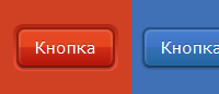
Разноцветные кнопки CSS3
Выбор здесь достаточно большой. Кнопки имеют 8 вариантов окраски. Используя разноцветные кнопки CSS3, вы можете сделать красивое горизонтальное меню. В последней версии IE кнопки выглядят не так плохо, как это могло бы быть, просто отсутствуют градиенты. Еще одна особенность кнопок в том, что здесь продуман вид при нажатии на кнопку. Градиент меняется, кнопка как будто вдавливается.
Код HTML
Код CSS
Код HTML
Code
<div class="column red">
<a href="#" class="button red">Кнопка</a>
<a href="#" class="button red alt">Кнопка</a>
</div>
<a href="#" class="button red">Кнопка</a>
<a href="#" class="button red alt">Кнопка</a>
</div>
Код CSS
Code
.button {
position: relative;
display: inline-block;
height: 33px;
line-height: 33px;
padding: 0 15px;
font-size: 15px;
color: #fff;
text-decoration: none;
text-shadow: 0 -1px rgba(0, 0, 0, 0.3);
border: 2px solid;
border-radius: 7px;
-webkit-box-shadow: 0 2px 1px rgba(0, 0, 0, 0.25);
-moz-box-shadow: 0 2px 1px rgba(0, 0, 0, 0.25);
box-shadow: 0 2px 1px rgba(0, 0, 0, 0.25);
}
.button:before, .button:after {
content: '';
position: absolute;
}
.button:before {
top: -5px;
right: -5px;
bottom: -5px;
left: -5px;
z-index: -1;
border-radius: 9px;
}
.button:after {
top: 0;
right: 0;
bottom: 0;
left: 0;
border-radius: 7px;
border: 2px solid rgba(255, 255, 255, 0.1);
border-bottom: 0;
}
.button.alt {
-webkit-box-shadow: 0 1px 3px rgba(0, 0, 0, 0.25);
-moz-box-shadow: 0 1px 3px rgba(0, 0, 0, 0.25);
box-shadow: 0 1px 3px rgba(0, 0, 0, 0.25);
}
.button.alt:before {
display: none;
}
.column.red {
background: #d04022;
}
.button.red {
border-color: #942110 #902010 #741a0d;
background-color: #d02e17;
background-image: -webkit-gradient(linear, left top, left bottom, color-stop(0%, #e74a29), color-stop(50%, #e6451b), color-stop(50%, #d02e17), color-stop(100%, #b3150b));
background-image: -webkit-linear-gradient(top, #e74a29 0%, #e6451b 50%, #d02e17 50%, #b3150b 100%);
background-image: -moz-linear-gradient(top, #e74a29 0%, #e6451b 50%, #d02e17 50%, #b3150b 100%);
background-image: -ms-linear-gradient(top, #e74a29 0%, #e6451b 50%, #d02e17 50%, #b3150b 100%);
background-image: -o-linear-gradient(top, #e74a29 0%, #e6451b 50%, #d02e17 50%, #b3150b 100%);
background-image: linear-gradient(top, #e74a29 0%, #e6451b 50%, #d02e17 50%, #b3150b 100%);
}
.button.red:before {
background-color: #ee442c;
background-image: -webkit-gradient(linear, left top, left bottom, color-stop(0%, #b32511), color-stop(100%, #f3533c));
background-image: -webkit-linear-gradient(top, #b32511, #f3533c);
background-image: -moz-linear-gradient(top, #b32511, #f3533c);
background-image: -ms-linear-gradient(top, #b32511, #f3533c);
background-image: -o-linear-gradient(top, #b32511, #f3533c);
background-image: linear-gradient(top, #b32511, #f3533c);
}
.button.red:active {
background-color: #e63b1b;
background-image: -webkit-gradient(linear, left top, left bottom, color-stop(0%, #a9110b), color-stop(60%, #de3819), color-stop(100%, #e63b1b));
background-image: -webkit-linear-gradient(top, #a9110b 0%, #de3819 60%, #e63b1b 100%);
background-image: -moz-linear-gradient(top, #a9110b 0%, #de3819 60%, #e63b1b 100%);
background-image: -ms-linear-gradient(top, #a9110b 0%, #de3819 60%, #e63b1b 100%);
background-image: -o-linear-gradient(top, #a9110b 0%, #de3819 60%, #e63b1b 100%);
background-image: linear-gradient(top, #a9110b 0%, #de3819 60%, #e63b1b 100%);
}
.button.red:active:after {
border-color: #e63b1b;
}
Создать сайт в uKit
Нужен классный сайт для бизнеса?
Воспользуйтесь сервисом uKit. Никакого кода!
Воспользуйтесь сервисом uKit. Никакого кода!
Чтобы оставить комментарий или отзыв под этой публикацией, войдите или зарегистрируйтесь.